Review Overview
Nokia Lumia 1320 Price
Features
Apps
Camera
Battery life
weight
Operating system WP8
Overall
The Nokia Lumia 1320 is the largest of Nokia’s Windows Phone line-up. It is matched only by the more expensive and more feature-rich Nokia Lumia 1520.
Both handsets have 6in screens and so both are phablets, but with the Lumia 1520 selling at BHD 250 and the 1320 at as I write, some differences in specifications are to be expected between the two. The price of the Lumia 1320 BHD 130 is attractive for a phablet, but have too many corners been cut?
What you won’t find here is anything that makes the Nokia Lumia 1320 more than simply a big phone. In this respect it fades away against the likes of the Samsung Galaxy Note 3, Acer Liquid S2 and Sony Xperia Z Ultra, which are examples of handsets that add features designed to make use of the large screen: Pen-based input and pop-up apps for example.
Still, like the Lumia 1520, the 1320 allows for more tiles on the Start screen – this means three of the standard size tiles on each row rather than the usual two. Because a standard sized tile can be divided into four smaller ones you can have twelve small icons on a row instead of eight (that’ll look like a double row). Or you can have one double width tile and four smaller sized ones. Did you follow that? Check out the image below to see what this space increase looks like in the real world. The important point is that this arrangement gives you more shortcuts to apps and information without the need to scroll vertically.
If you are keen on Windows Phone because you like the connection with Microsoft Word, Excel and PowerPoint, with Office 365 and OneDrive (the renamed SkyDrive), then you will probably be a fan of the bigger screen. When paired with a keyboard I reckon it might be possible for some people to produce some types of work-related documents, or to tackle some serious mobile email. Not everyone, but some people.
But you have to take into consideration the screen resolution here. At 1,280 x 720 pixels it is a way behind the Lumia 1520 with its screen resolution of 1,920 x 1,080 pixels. The 245ppi here is much lower than the 1520’s 367ppi. I’ve said in the past that you can get to the point where ever higher pixel counts stop making sense – your eyes can only distinguish so much sharpness when it comes to ppi. Here, however, the low pixel count is noticeable.

The back itself has a matte finish, and it is grippy. That’s really important in a handset of this size – a full 85.9mm wide and 164.2mm tall. That and the weight of 220 grams made this handset feel like one of the lumpier, less comfortable 6in phones I’ve had to carry around for testing.
The button placement is sensible too. The on/off switch is in the centre of the right edge, the volume rocker is at the top of this edge, and the camera shortcut is at the bottom. As usual, this wakes the handset from standby right into the camera app for quick shooting.
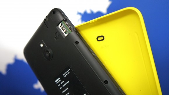
Nokia has saved development money on this handset by selecting a dual-core 1.7GHz Qualcomm Snapdragon processor, with 1GB of RAM in support. Windows Phone has a relatively light footprint and the combination ran perfectly adequately. There’s 8GB of built in storage, with just half of that free for your own use. There’s no NFC, but there is a microSD card slot under the backplate, stacked under the microSIM slot, and you are asked at startup if you want to use a card to store pictures, music and video there. You get 7GB of OneDrive storage too – and data can be automatically backed up there.

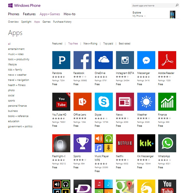
Windows Phone still suffers from a relatively light app store. If you are impressed with the Lumia 1320 – or indeed any Windows Phone-based handset, and are considering moving from Android or iOS, check that your favourite apps and games are in the store first.
Check out the top free apps till april 2014: Windowsphoneappstore.
Nokia helps Windows Phone along in the apps department by adding some of its own goodies. As ever the navigation apps Here Maps and Here Drive are present, as is my favourite Nokia add-on, Nokia Music, the music streaming of which regularly hammers the battery of any Lumia handset I have in for review.
This all feels like a very so-so set of specifications, but there are a couple of factors to shout about. This is a 4G handset, and to see 4G in a relatively low cost handset is pleasant. In addition the 3,400mAh battery does a good job of keeping the Lumia 1320 going. It is doubtless responsible for some of the handset’s weight, but you might be happy with that. All but the heaviest of users ought to exceed a day, and if you are a frugal user you might even stretch to two days between charges.
Verdict
The Nokia Lumia 1320 has microSD expansion, which is nice, and 4G, which is very nice, but nothing that really takes advantage of the large screen. It is, as 6in handsets tend to be, a bit of a pain to fit into pockets. If you really need the big screen it is worth considering, and if you particularly want 4G, Windows Phone and a large screen – and you’re on a limited budget – then it’s certainly worth a look.
 iTechBahrain Information Technology Digital Marketing Web & Mobile Development Services
