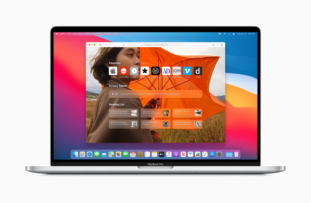
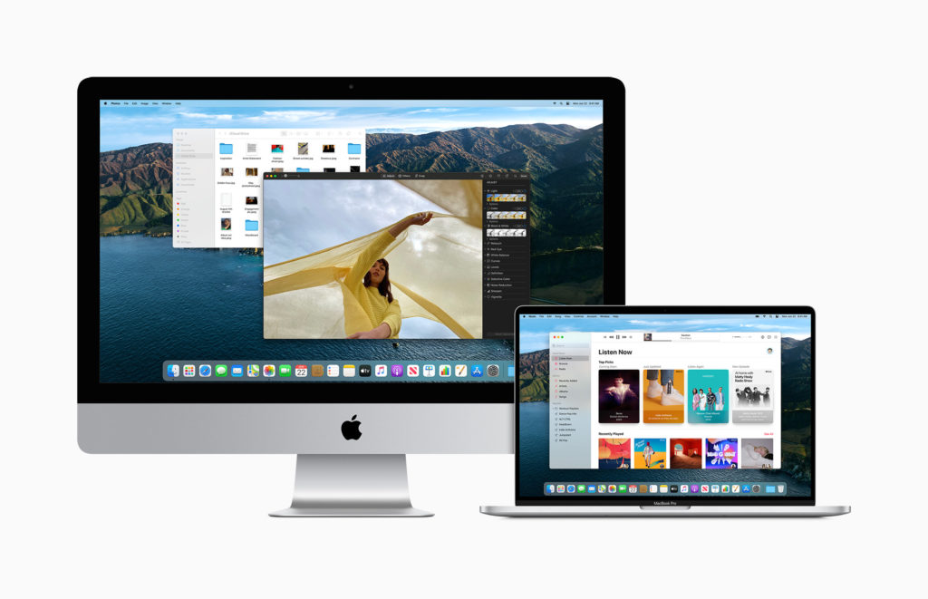
Apple has unveiled the newest macOS iteration Big Sur, at WWDC, taking the wraps off a new visual redesign for version 11.0 of the OS, and a variety of new features that are coming to its laptops and desktops.
The new visuals extend from all-new icons that reimagine classics like Mail, Photos and others, alongside new visual languages inside the apps themselves

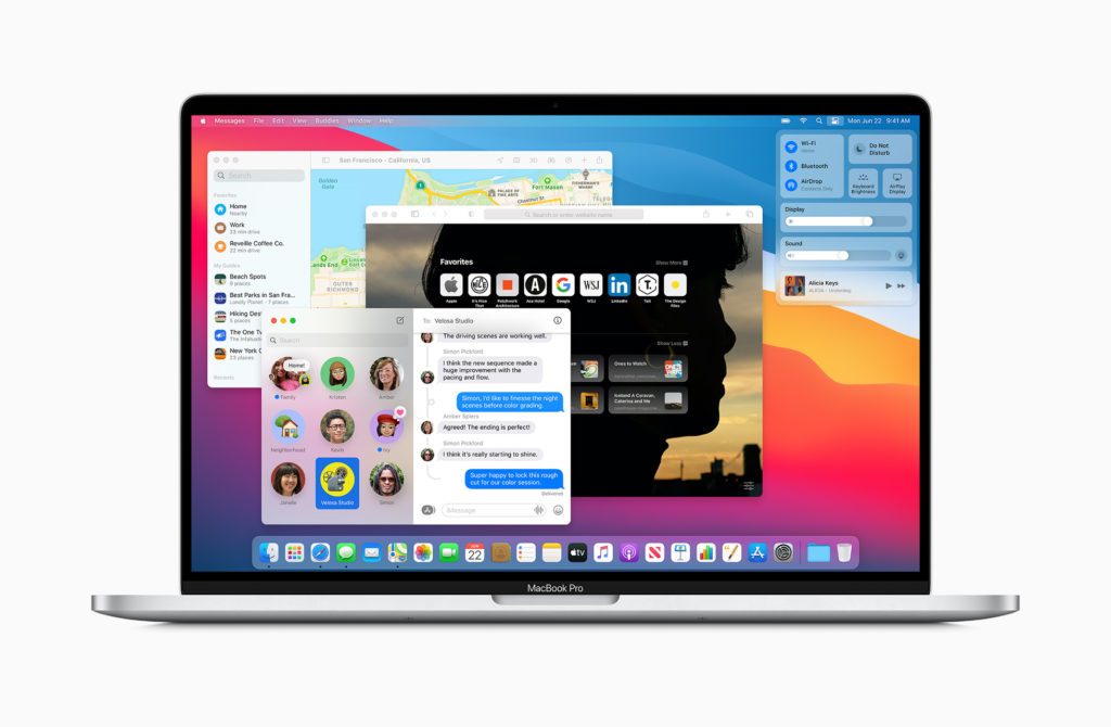
The updated OS will bring new app versions to the likes of Maps and Messages, too, bringing many of the enhancements announced for iOS 14 and iPadOS 14 to the laptop experience. In fact, you’ll notice across many of these images that the visual language of iPadOS and Big Sur is the closest the two ecosystems have ever been. Make of that what you wil

Apple’s presentation ran through a huge laundry list of changes coming with Big Sur, with highlights including a new toolbar system that recedes icons out of view when you’re not using them, a menu bar that’s translucent and blends with your desktop background’s colours.

A major addition comes in the form of Control Centre, bringing control over key settings to a sidebar, which will let you change things like your brightness, sound and more in one place.
Safari gets an update
Safari also got a lot of love in Apple’s presentation, a browser that’s gone from a laughing stock to a really solid option over the last half-decade, emphasising its speed over competitors (Chrome in particular), and the enhanced, granular privacy measures it leverages over things like extensions and stored passwords. New tab designs and a customisable homepage were also shown off.
In fact, extensions were given a bit of a spotlight, showing off how they’ll be easier to install and use, compared to the current situation that’s a little messier. Apple says it’s the biggest update the browser has ever had.
Elsewhere, notifications are getting richer and more granular on the Mac, while the new dock design is lighter and more floaty, in Apple’s own words.
 iTechBahrain Information Technology Digital Marketing Web & Mobile Development Services