Following four developer previews of the software, Google has released Android 11 as a public beta, and that means anyone who wants to install it on their Pixel phone can. It’s no longer a tricky process.
Currently, it’s only available to download for a few Pixel phones, but installing it is much simpler than it was in its dev preview stage. You just have to go through the process.
When is Android 11 being released?
Beta is out now, public version coming in September
As with most presentations and launch events for 2020, Google was planning to shift its announcement online. Sadly, the Android 11 beta launch show originally planned for 11am ET on 3 June was postponed. Instead of a big online reveal, Google just announced it via press release and made the beta available on 11 June.
While the second public beta is already out, the official public version of the software isn’t likely to land until later in the year. Google seemed to indicate that it will be on 8 September, but that could still change.
Which phones will get it?
Initially, the launch made its way to the following Google Pixel phones:
Pixel 2 and 2 XL
Pixel 3 and 3 XL
Pixel 3a and 3a XL
Pixel 4 and 4 XL
Once the public beta landed, other manufacturers started their own beta programs. OnePlus and Oppo both rolled out Android 11 beta programs for some of their flagship phones.
Specifically, for OnePlus the 8 series is included while for Oppo, the Find X2 and Find X2 Pro are included. For its sister-brand, Realme, the X50 Pro is in the program. Xiaomi, likewise, announced plans to bring it to the Mi 10 and Mi 10 Pro while Poco has announced it will come to the F2 Pro.
Message bubbles and ‘priority’ conversations
When you receive a message through the regular messages app, you can have it show up a notification in a floating bubble on the screen similar to how Facebook Messenger’s Chat Heads works.
Eventually this will be available to other third party apps, but currently it’s just the one. To use it, just long-press a message notification and tap “show in a bubble”, and now you get your bubbles.
From this point on – until you remove the bubble from the screen – any new messages will popup up as a window from this bubble. We presume this same method will apply if and when developers for apps like WhatsApp and Telegram implement the capability in their apps.

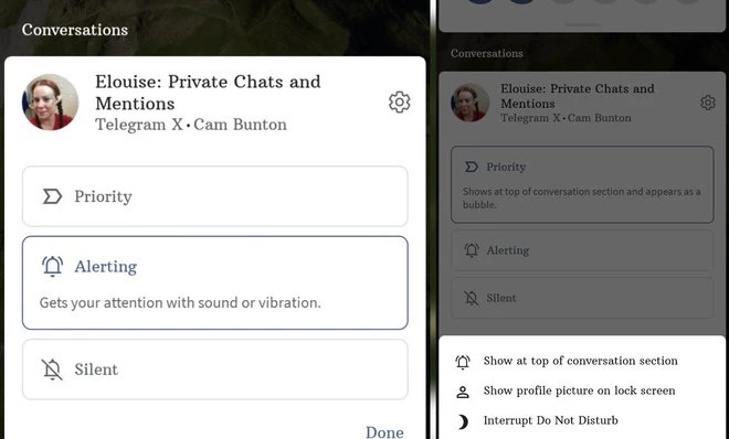
In addition to that, when you get a message from a contact who you like chatting with often, you can long-press the notification and mark that particular conversation as a priority. That means you’ll get their notifications even when your phone is on ‘Do Not Disturb’
Redesigned notifications
What’s cool is that Android 11 breaks out and sorts notifications into relevant groups, so conversations – like the aforementioned SMS messages – appear at the top in their own easy to read section, making it easier to quickly reply and carry on with your tasks. Splitting them away from the other stuff you probably don’t care about as much.
Then others are split into alerting notifications and silent notifications. The former is for system notifications where something might be running in the background. The latter is for apps that get lots of alerts that you don’t necessarily need to see or hear all the time. So social media and email fit into here nicely.
As well as that, the actual visual interface of the notifications as been altered and developed throughout the Android 11 preview phase. There’s some added transparency and gradients in the most recent update, giving it a little more finesse.

New Power Menu with smart home controls
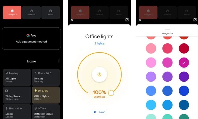
With Android 11 the interface that shows up when you long-press the power/sleep button on the side is a lot more useful. It not only shows you the usual power, restart and emergency contact options, but also easy access to GPay and smart home controls so you can quickly switch your smart home products on or off, or long press their widgets to adjust them in a more granular fashion.
New Media playback widget
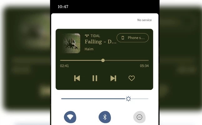
Any app playing media on your device will create a widget in your quick settings drop-down menu, complete with colour matched background to the album art. We’ve tested it with Tidal, but it’ll work with pretty much any media app. As a little bonus, when you tap the play/pause button, you get a nice ripple animation.

As well as that, there’s an easier way to switch media output so you can switch it to play on the device, in your headphones, cast it to a TV or audio streamer.
Resizable picture-in-picture window
Whenever you close a video app like YouTube or Netflix in Android it automatically puts that video in a small floating window on top of everything else, and keeps playing the video. In Android 11’s developer preview, Google added the option to resize that picture-in-picture window.
Screen recording
One cool new feature which some other Android phones already do – like the OnePlus 8 and 7T series phones – is easy screen recording. Drop down the quick setting shade, and the option is right there.
Once you tap on the screen recording quick setting tile there’s a pop-up window asking you to confirm whether you want to definitely start recording. Befpre starting you can select if you want to record audio through your microphone, or if you want to record the device’s audio directly.
Once confirmed, it’ll record whatever you’re doing on your phone before you decide to stop and save the footage. You can also cancel the recording any time.
Smart app suggestions?
When you first set up Android 11 you’ll get a popup asking if you want to use Google’s auto-generated app dock. This means, instead of you choosing the four or five apps you want at the bottom of every home screen, Google populates that area with what it thinks you want access to. So far, it’s not been all that useful, but it’ll likely get better with time as the phone learns usage patterns.
New Recent apps screen
There’s an intriguing change to the recent apps screen in the latest developer preview, which gets rid of quick app suggestions, and replaces it with a screenshot/share option. Plus, the cards showing thumbnails of any recent apps have been made bigger too.
In the fourth developer preview, Google also added a ‘Select’ button to the bottom row of icons on the recent apps screen to make it more clear that you can – indeed – manually select text or images from the app thumbnail card.
What’s more, when you swipe a card away to dismiss it/clear it from memory, there’s an undo option that lets you bring it back again when you’ve swiped it accidentally.
Back gesture sensitivity
When you’ve activated Android’s gesture navigation, swiping in from the edge replaces the ‘back’ button. In Android 11 you can adjust how sensitive you want this gesture to be, this will be helpful if you’re in an app with its own dedicated controls and gestures near the edge of the screen. You can even individually adjust the setting for each side of the display.
iPhone-like screenshot visuals
Similar to how other Android manufacturers – and indeed the iPhone – do it, when you take a screenshot, you’ll see a small thumbnail of that screenshot appear in the bottom corner of the display. It has a small ‘x’ to dismiss it, as well as ‘share’ and ‘edit’ options. That means it no longer takes up a full notification at the top of the screen.
Dark mode scheduling
Dark Mode first appeared as a system wide setting on Android 10, and with Android 11 you can schedule and automated it. Set the time you want it to switch on or off each day manually by setting the time within the settings.
Like so many apps and other Android phones you can also choose to have it come on at sunset, and switch off at sunrise.
Single time app permissions
Single time permissions is perhaps one of the biggest privacy based features. It lets you tell an app it can only access your location just that one time you’re using the app, rather having to choose between ‘all the time’, ‘only when I’m using it’ or ‘never’. It gives you a lot more control.
Voice access – controlling your phone with your voice
One pretty smart accessibility feature is the ability to control your phone with your voice using Google’s Voice Access. With it activated, you can do anything simply by speaking. So if you want to launch an app you can, or even compose a message, send a tweet, view your photos. It assigns numbers to certain control elements within the user interface too. That means, for instance, if the number ’12’ is over the ‘X’ in the corner or the number ‘1’ over the ‘delete’ button, you can just say those numbers and it’ll action those commands as if you’d pressed them on screen.
 iTechBahrain Information Technology Digital Marketing Web & Mobile Development Services